The ECIU University is an alliance of many stakeholders: 12 partner institutions, numerous societal stakeholders and different target audiences. In order to build a cohesive brand, and accurate, strong, value-based visual identity for the ECIU University was created. Here is a look at the new identity and its creative process.
In the world of information overload, branding has become increasingly important. As the significance of branding grows, it affects different levels and sectors of society: businesses, universities and countries. What’s more, branding not only bridges connection outside the organisation but also inside, especially through internal communication and employee engagement. Therefore, a brand is not just about cultivating a “good look”, it has become an important “backbone” of all organisational activities.
In the case of ECIU University, the brand provides tools to tell a unified story and gives the basis for strong and integrated dissemination activities, doing so, it supports communication sustainability in the long-term. The task to create a new visual identity for the ECIU University was taken up by Critical, a Lithuanian strategic design agency, and Kaunas University of Technology which was working alongside communications and marketing teams in other ECIU University partner institutions.
ECIU University is the first European university where learners and researchers cooperate with cities and businesses to solve real-life challenges. The innovative university model was launched in November 2019 by the ECIU (European Consortium of Innovative Universities) Alliance. With this launch, the ECIU now intends to focus future activity through the university, making the ECIU University the face of the ECIU Alliance.
“The set up a long-lasting new organisation needs recognised brand, look and feel; it has to be robust and accepted by all; it has to also mark the beginning of the new endeavour. The new visual identity will give colour to the ECIU University activities”, says Sander Lotze, Project Director at the ECIU University.
“Visual identity helps people to notice, recognise and interpret a brand faster. This is very true at a time of change in the ECIU when the university is becoming the core activity of the Alliance. The uniqueness, unconventionality and courage must be revealed from the very first impression, which undoubtedly influences further acquaintance with the content”, says Jonas Liugaila, Design Strategist at Critical and Vice President of the International Council of Design ico-D.
ECIU University brand identity
The new visual identity of the ECIU University will help to construct a homogeneous and spread the message to different audiences, helping the birth of a new, modern and unconventional university. ECIU University is a university that provides not only a degree but relevant competences and skills by solving real-life challenges. It is a new type of university which connects people and empowers them to make a real impact on this world. The new ECIU University visual brand identity is based on core values of innovation, connection, rationality and timelessness.
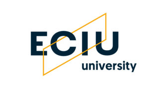
The ECIU University logotype is in dark blue and yellow colours. Yellow stands for the energy and entrepreneurial spirit while dark blue adds balance and sophistication, giving the impression of timelessness. Contrasting shape, colours and typography designs a rational logotype while also communicating a determination to grow, cooperation and innovation.
The same diagonal shape is used in the visual identity in order to maintain brand recognition while further emphasising growth and connection. A simple structure allows this graphic element to be used in many ways and adapt to situations for the brand to be dynamic.
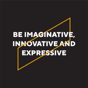
According to Benjaminas Alimas, designer at the agency Critical, one of the authors of the ECIU University visual identity, “the main and the most memorable feature is the rising symbol, which semantically contributes the most to the brand recognition. It is a symbol that can be interpreted differently in the visual identity structure that helps to create a dynamic brand image. The contrasting and bold colour gamut helps to recognise the ECIU University brand as innovative and expressive”.
Lotze, Project Director at ECIU University, adds that the new identity has a clear connection to the previous visuality of the ECIU, so people who know the old logo can still relate to it.
“But at the same time, it is a very clear new brand. And even more important is that the visual identity sends out a fresh, modern message. It embodies our core values of who we are and how we want to present ourselves. Moreover, it shows that we want to build something new; it gives space to use next it to the own local university brand and, last but not least, it is appealing to different target groups”, he says.
Giedrė Šadeikaitė, PhD, Director of KTU International Relations Department and Work Package Lead for the ECIU University Dissemination and Sustainability activities, adds, “the fresh look and feel of the new logotype and visual identity are contemporary while at the same time building on the ECIU history, is unconventional and easy-to-understand, is casual but timeless. It conveys the sense of quality, reputation, growth mindset, and cohesiveness with every piece of content that the ECIU University delivers”.
The inclusive design allowed everyone to have their say
The inclusive design process has been chosen to ensure that the voice of all partner institutions is heard. Everyone participated in the process from the early stages. They were researching the problem and its context, the needs of those involved, generating ideas, and voting for proposals. One of the most important advantages of the inclusive process is that the expectations for the outcome are made transparent, allowing all parties to have a say and feel a sense of ownership. Also, the process strengthens relations within the community.
ECIU University’s visual identity creation process had more than 30 participants from the 12 institutions involved. Intensive workshops and a number of meetings were held over the course of three months, and several questionnaires were also circulated.
“It is important that all universities could take part in many workshops. Although we did it completely online, which is a challenge, everybody felt connected. The agency listened to all input and used democratic principles to make sure we choose the best one. In summary, we are very satisfied with the process of inclusive design”, says Lotze.
Šadeikaitė notes that “the process of the ECIU University logotype and visual identity creation has reflected who we are as the ECIU University community and how the values of cooperation beyond any borders, transformative innovation and connectedness lead the way we work”.
“Undoubtedly, the strongest part of the ECIU University identity is the fact that participatory design process has received several dozen ambassadors in several European countries. These ambassadors will communicate the values and uniqueness of the brand”, says Liugaila.
Project “ECIU university” is funded under Erasmus+ programme Key Action 2: European Universities.


